


Design Library
After addressing the inconsistencies, we were able to recreate our library of design components that could be reused and updated as we continue to evolve.

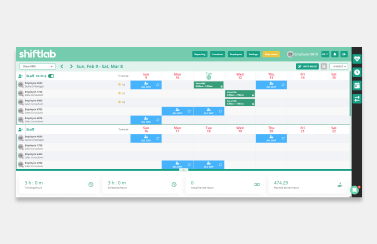
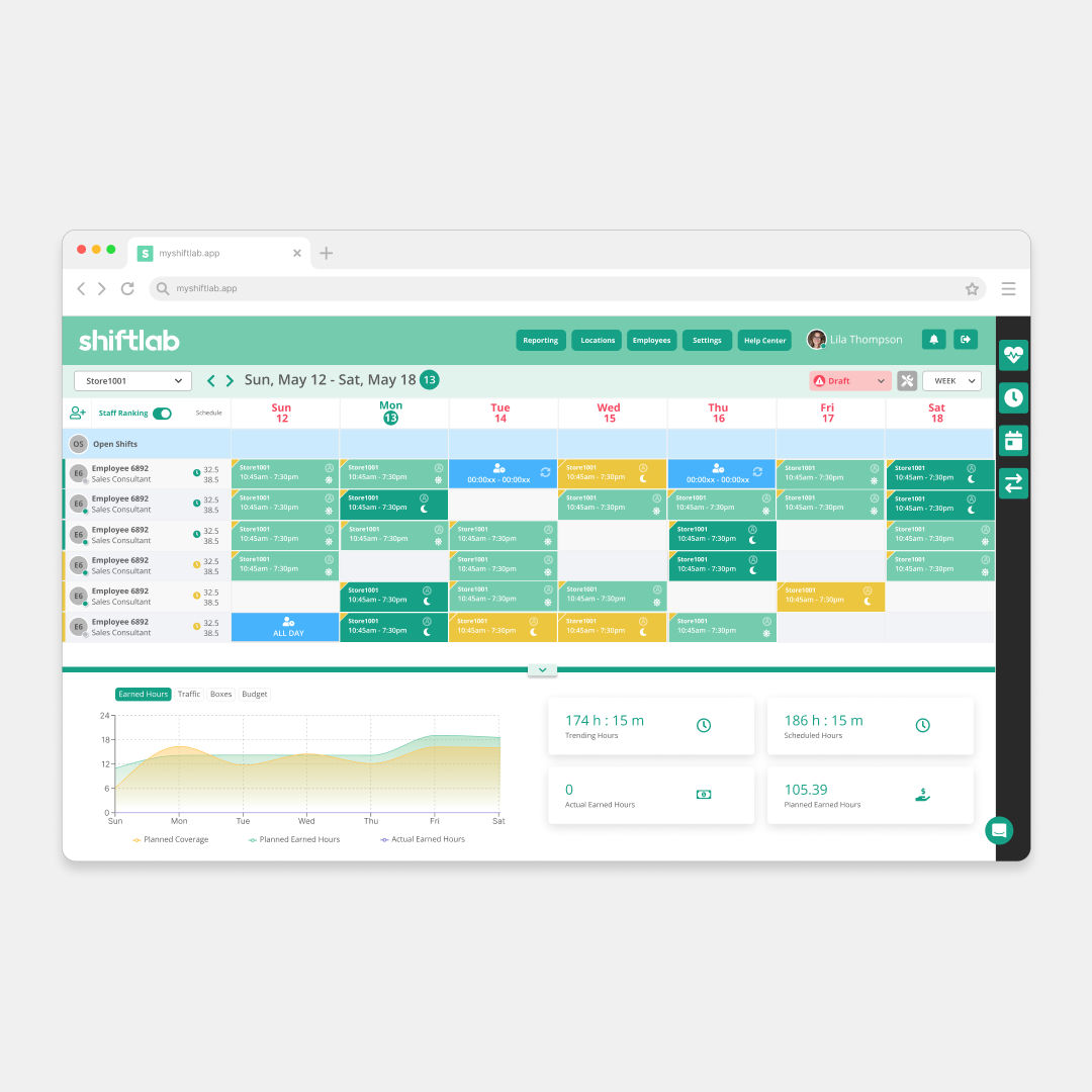
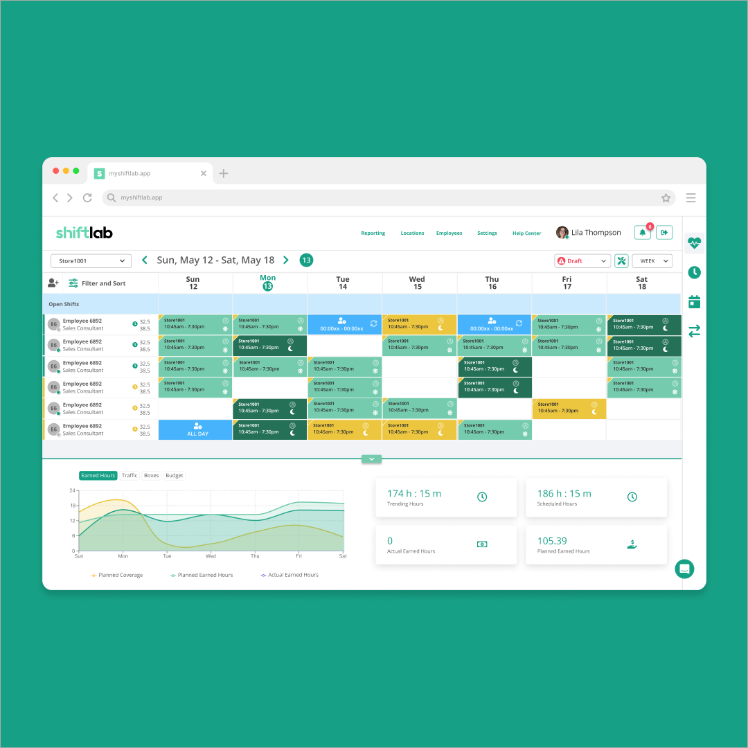
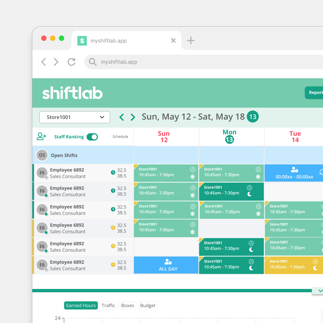
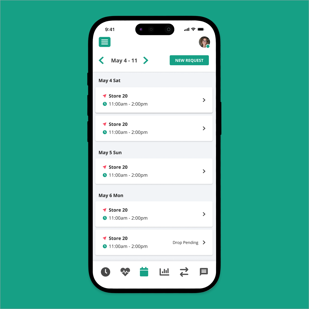
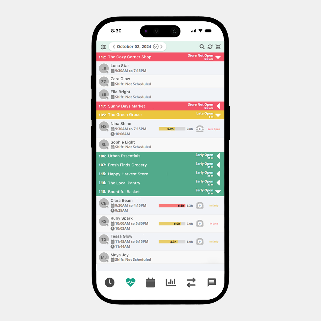
Home Page - Schedule
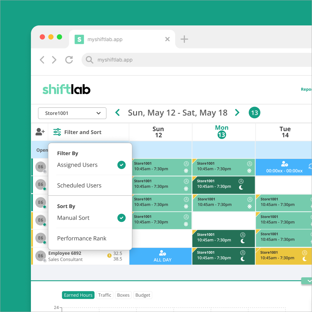
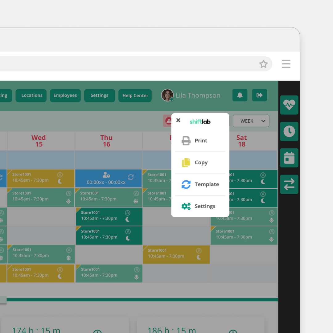
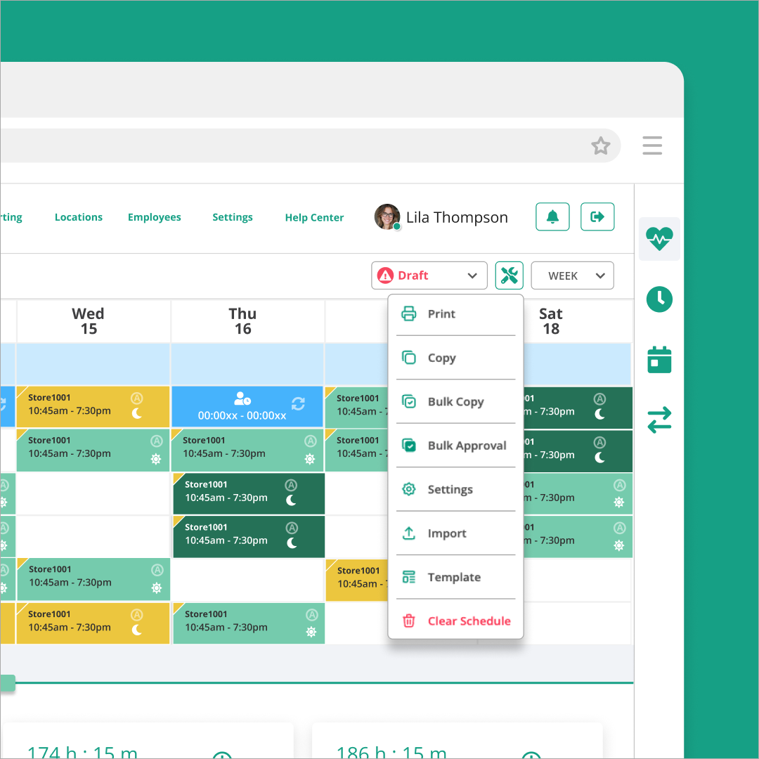
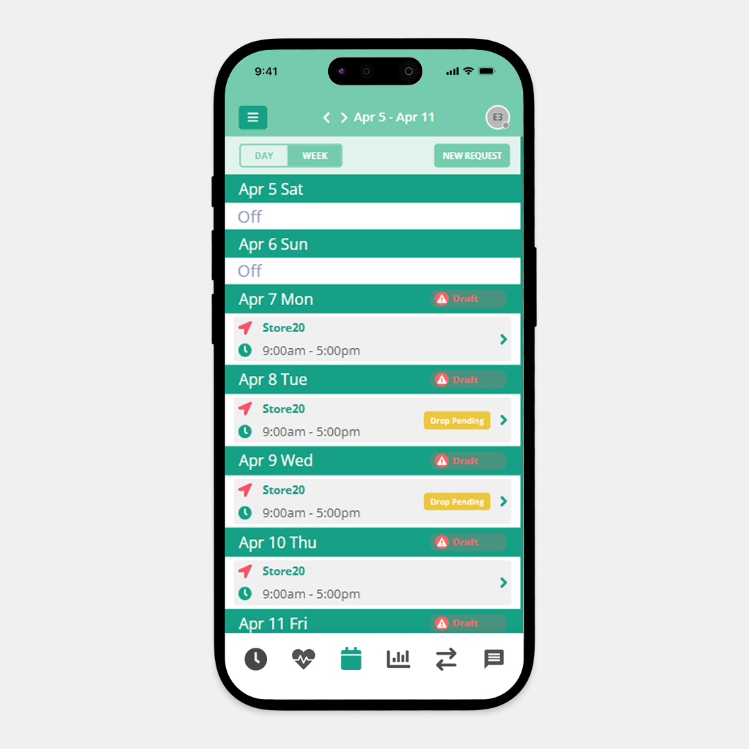
The main scheduler is an integral part of Shiftlab. We added an improved filter and sorting menu for your employees, an organized toolbox to make changes to your schedule, and updated our graph's aesthetics.
- Scheduler
- Filter & Sort
- Toolbox
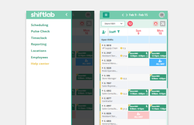
- Mobile Schedule
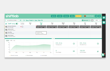
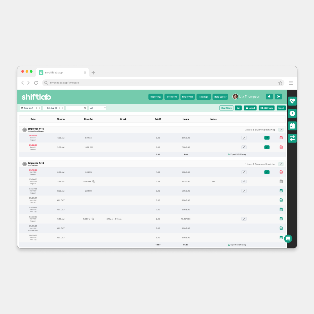
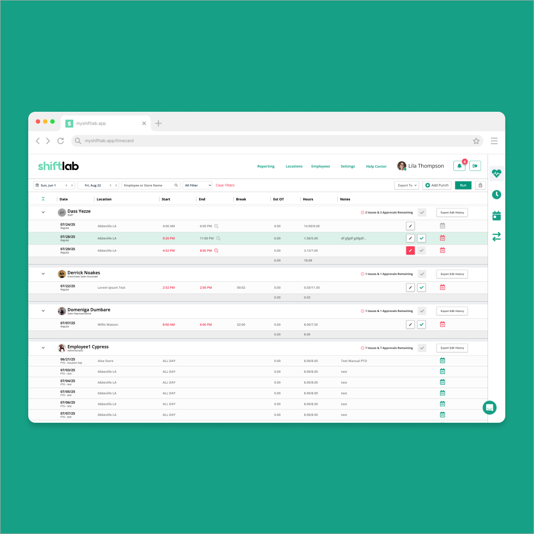
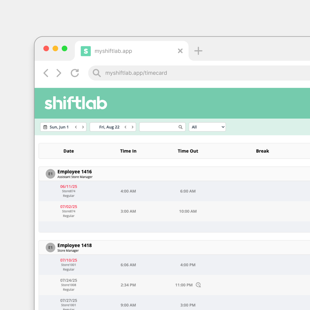
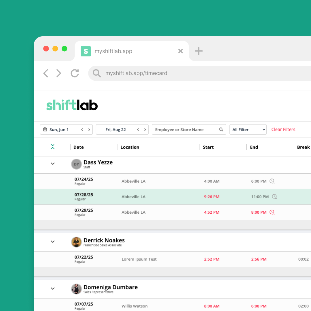
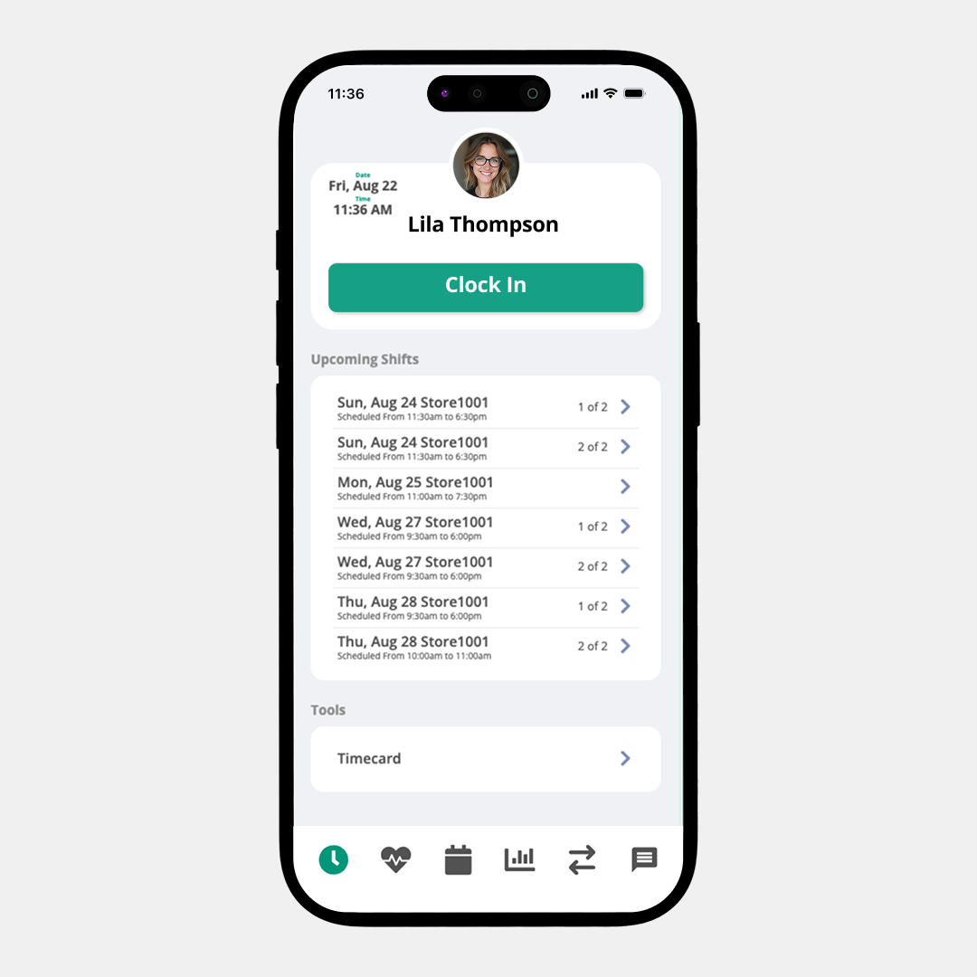
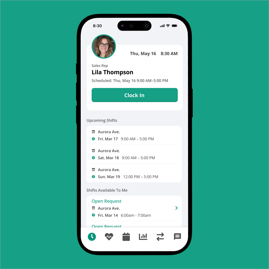
Timecards & Timeclock
Timecards: we added collapsible employee headers for a better viewing experience. We updated the icons and buttons to match our new overall look.
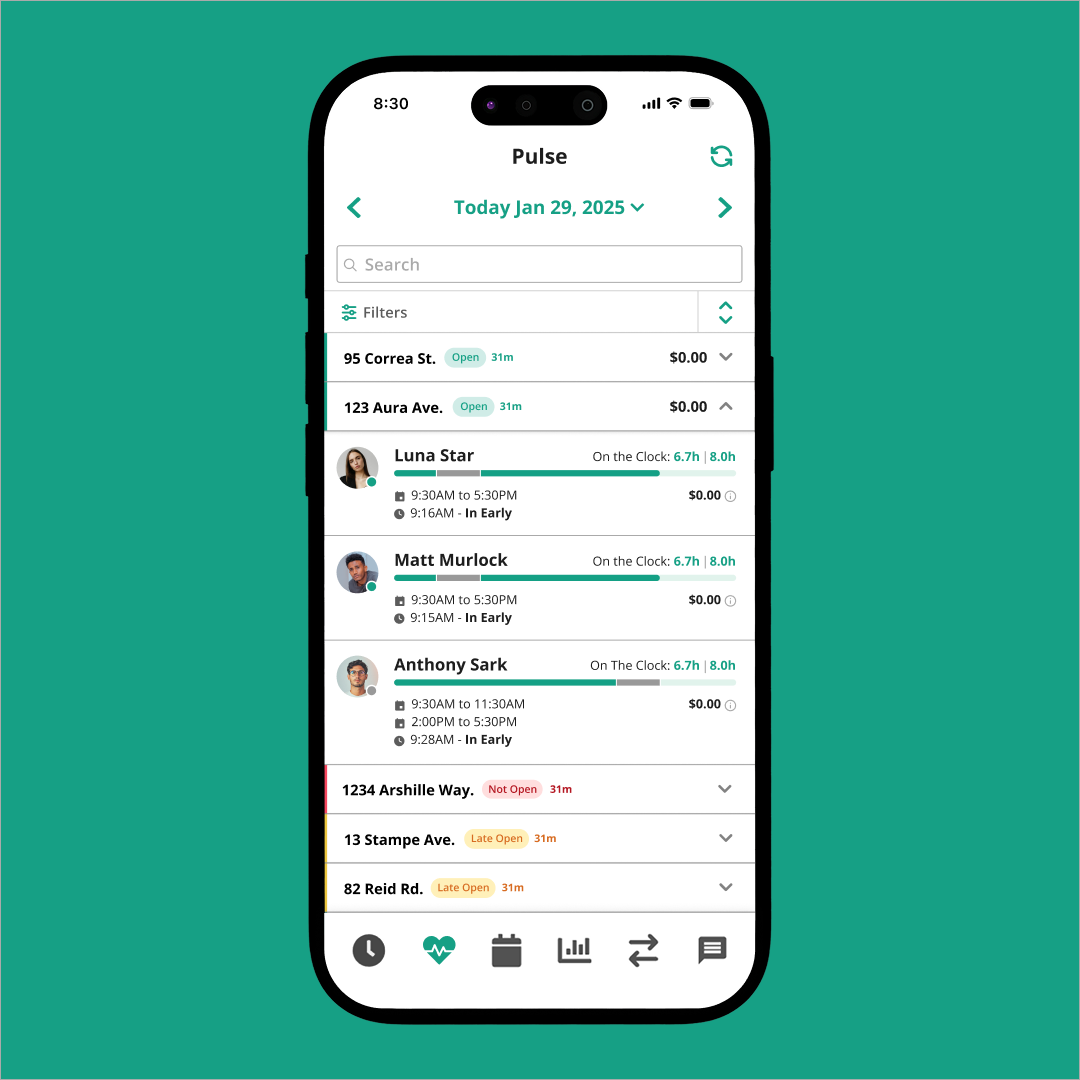
Timeclock: we adjusted our mobile view to be more user friendly, and added more information about clocking in, when your next shift is, and if you have any swap requests.
- Time Card
- Dropdown
- Clock In
- Pulse
Everything Else
The rest of Shiftlab also got a refresh and we wanted to showcase some of the smaller quality of life changes we added.
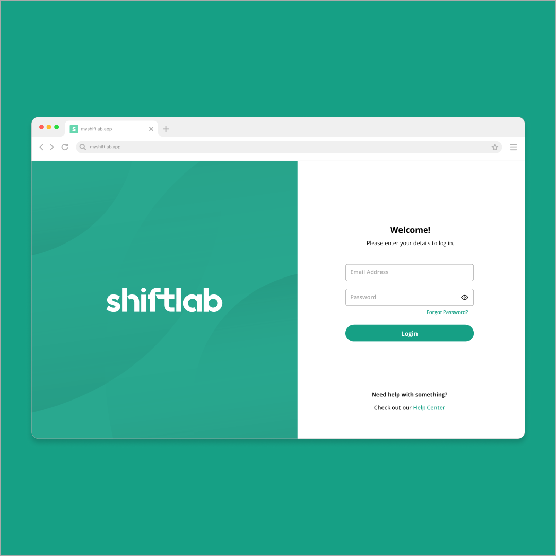
- Login
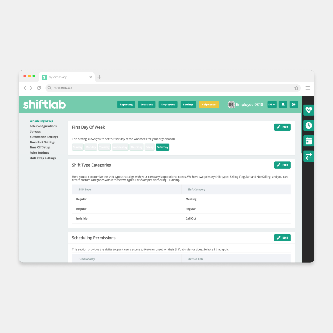
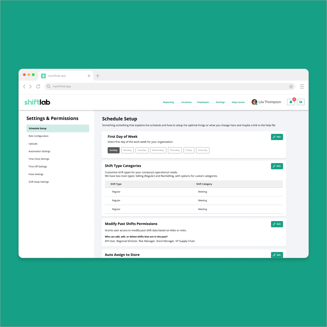
- Settings
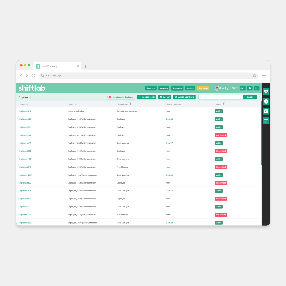
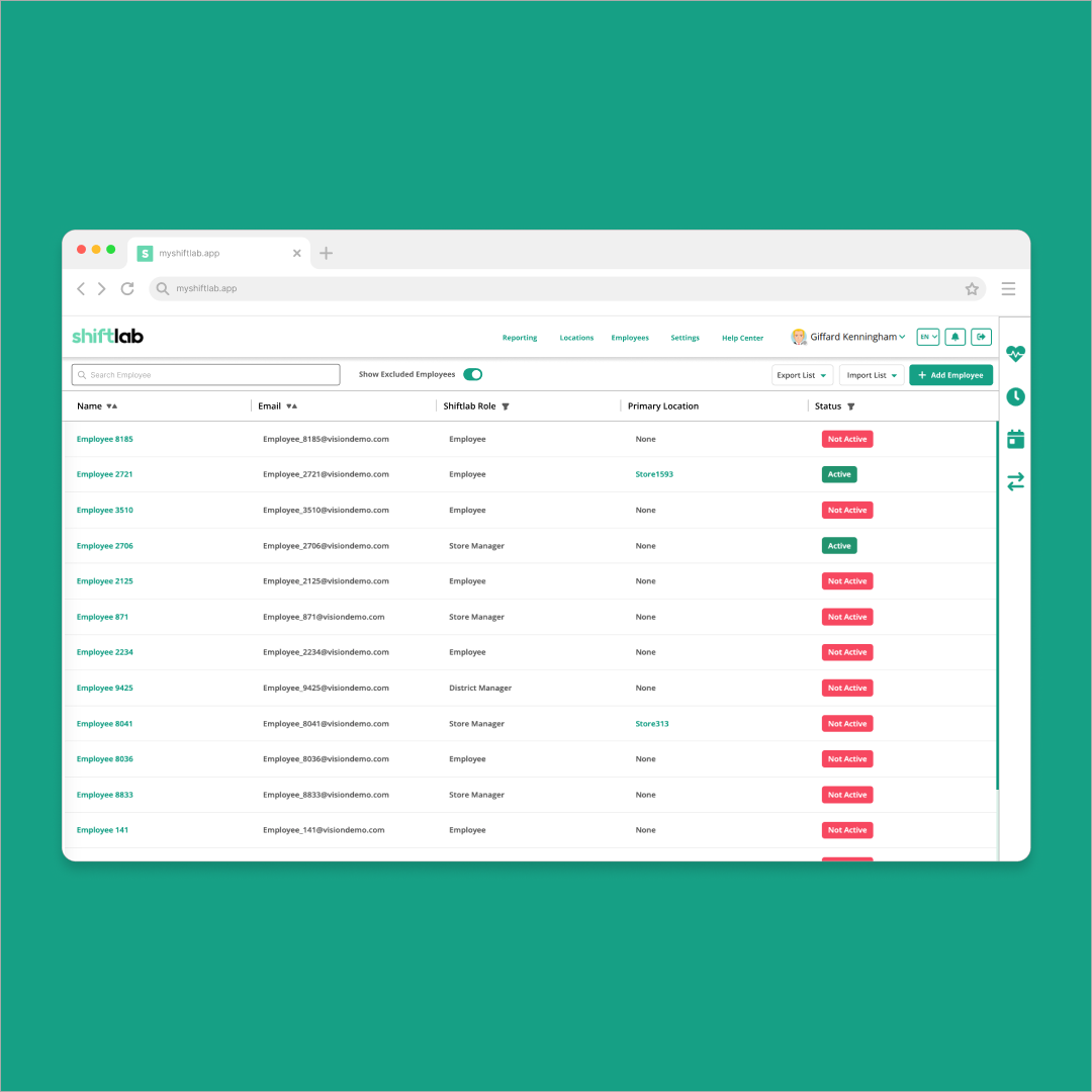
- Employees
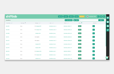
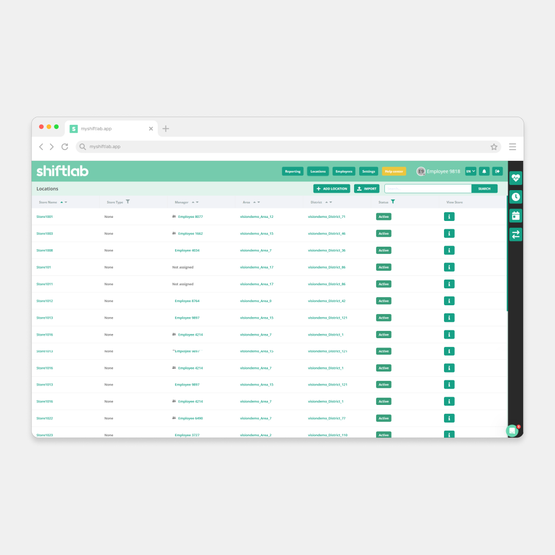
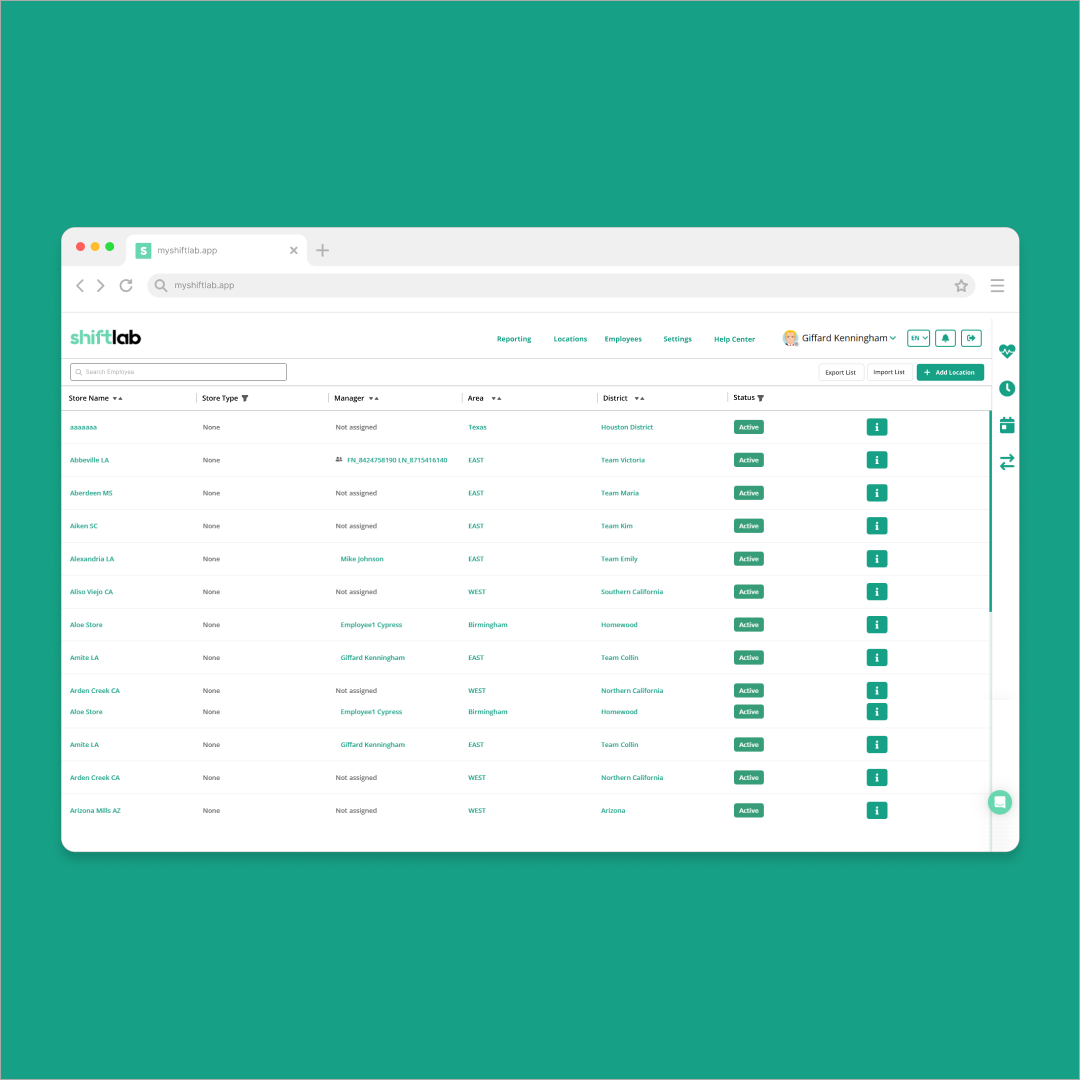
- Locations
Everything Else
The rest of Shiftlab also got a refresh and we wanted to showcase some of the smaller quality of life changes we added.
- Login
- Settings
- Employees
- Locations